Viedoc had strong marketing and a talented team, but their website wasn’t pulling its weight. It didn’t really show off what they could do, and it struggled to turn visitors into customers. The site was held back by clunky UX, an old CMS that was tough to work with, and lots of missed chances to convert. What they needed was a modern, flexible solution that could grow with them and bring their marketing together.
Outline
As design lead, I partnered with the project manager to plan workloads and keep the project on track. I guided the entire design process — from setting the visual direction through concepts and building the UI design system to shaping component functionality and visuals, and finally preparing polished designs for developer handoff.
My role
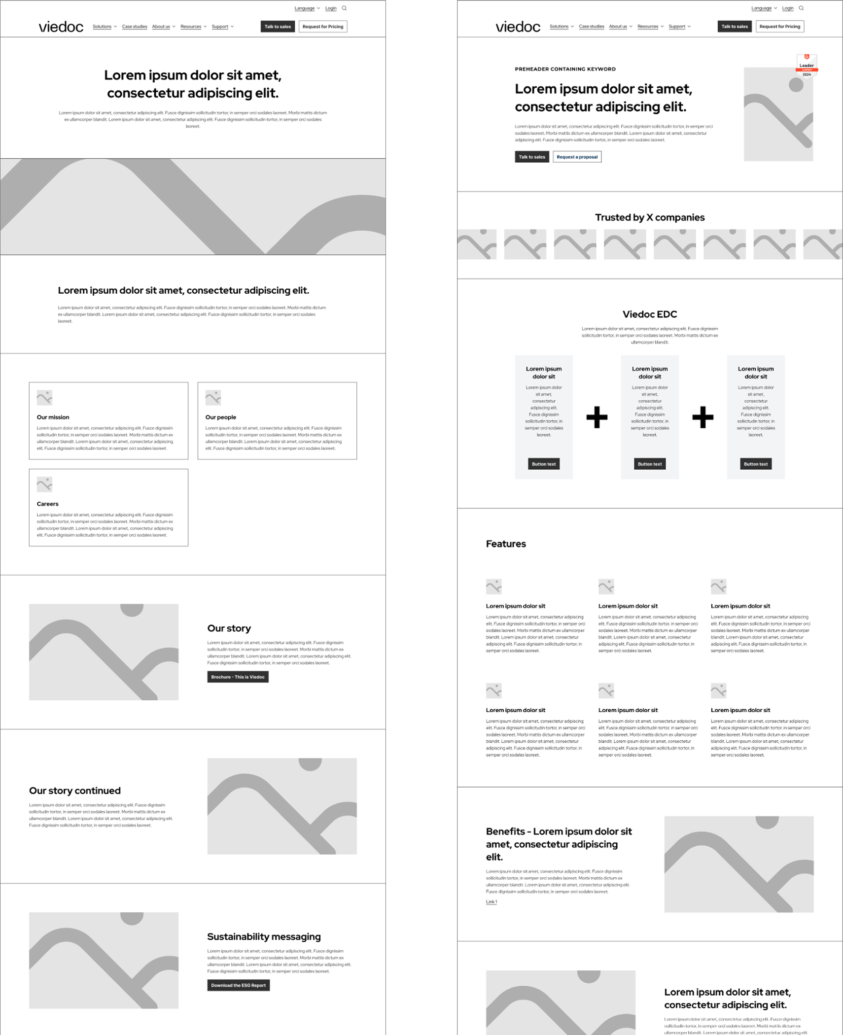
Working closely with a strategist to create a set of lo-fi wireframes to shape a series of specific action based user journeys and more clearly defined page content hierarchies.
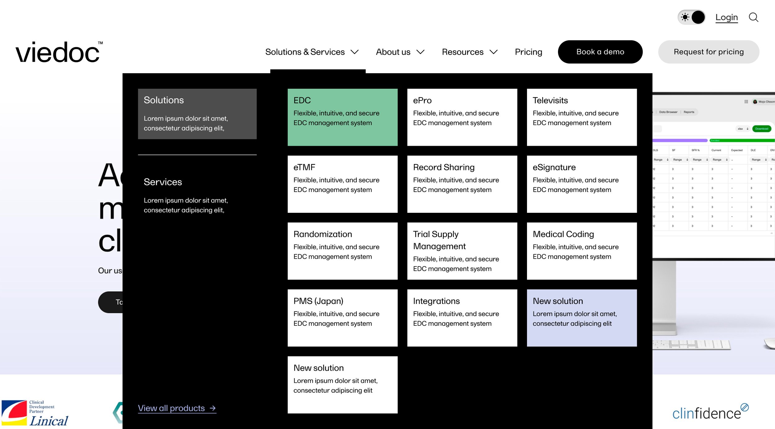
All products, solutions and resources were clearly surfaced and signposted for maximum ease of navigation and user flows were extended by ensuring all pages had no dead ends.
Wireframing
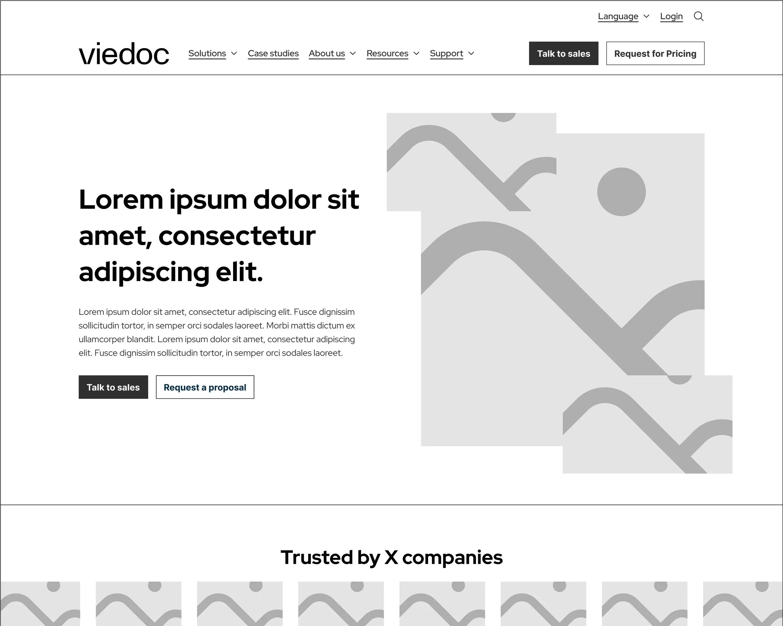

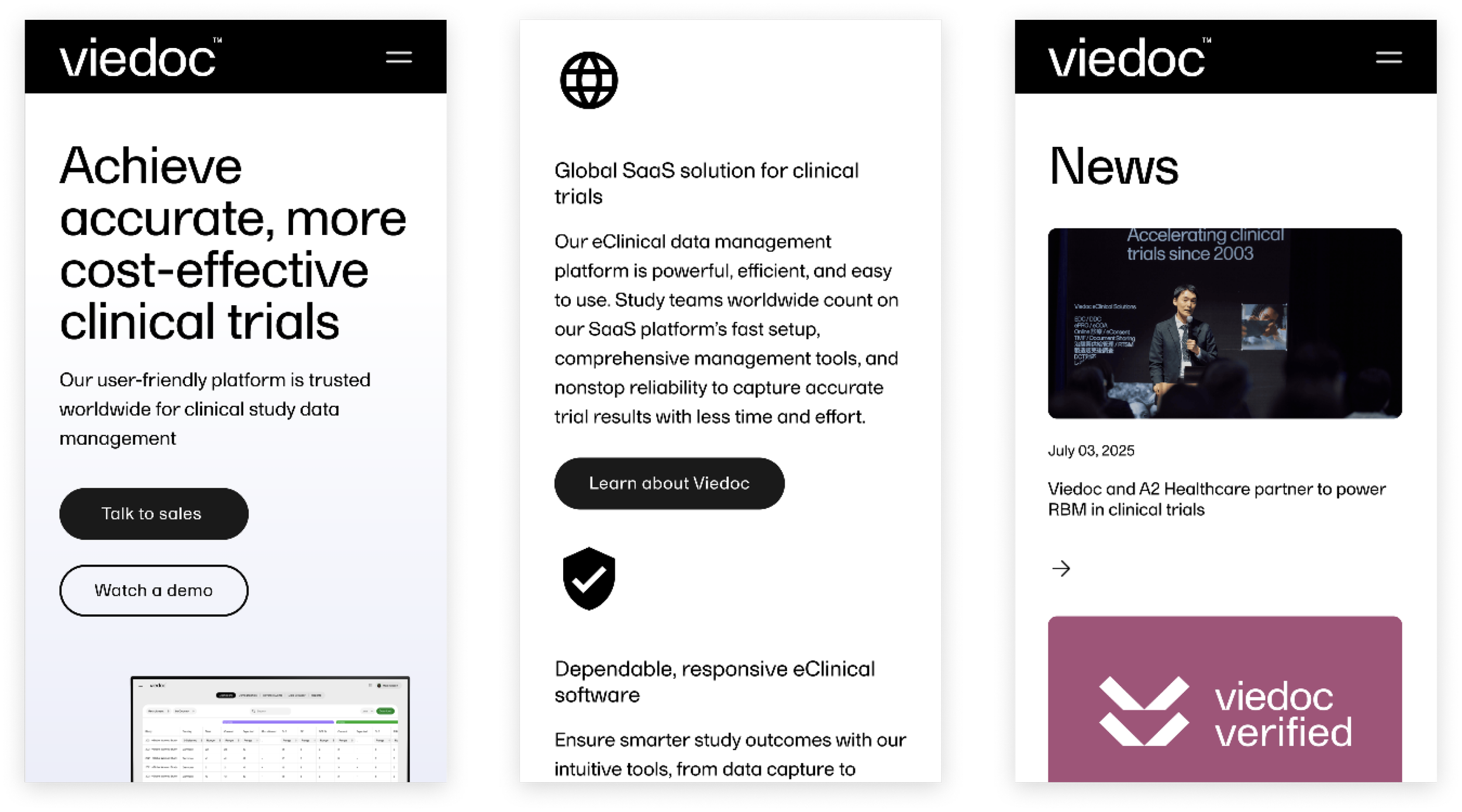
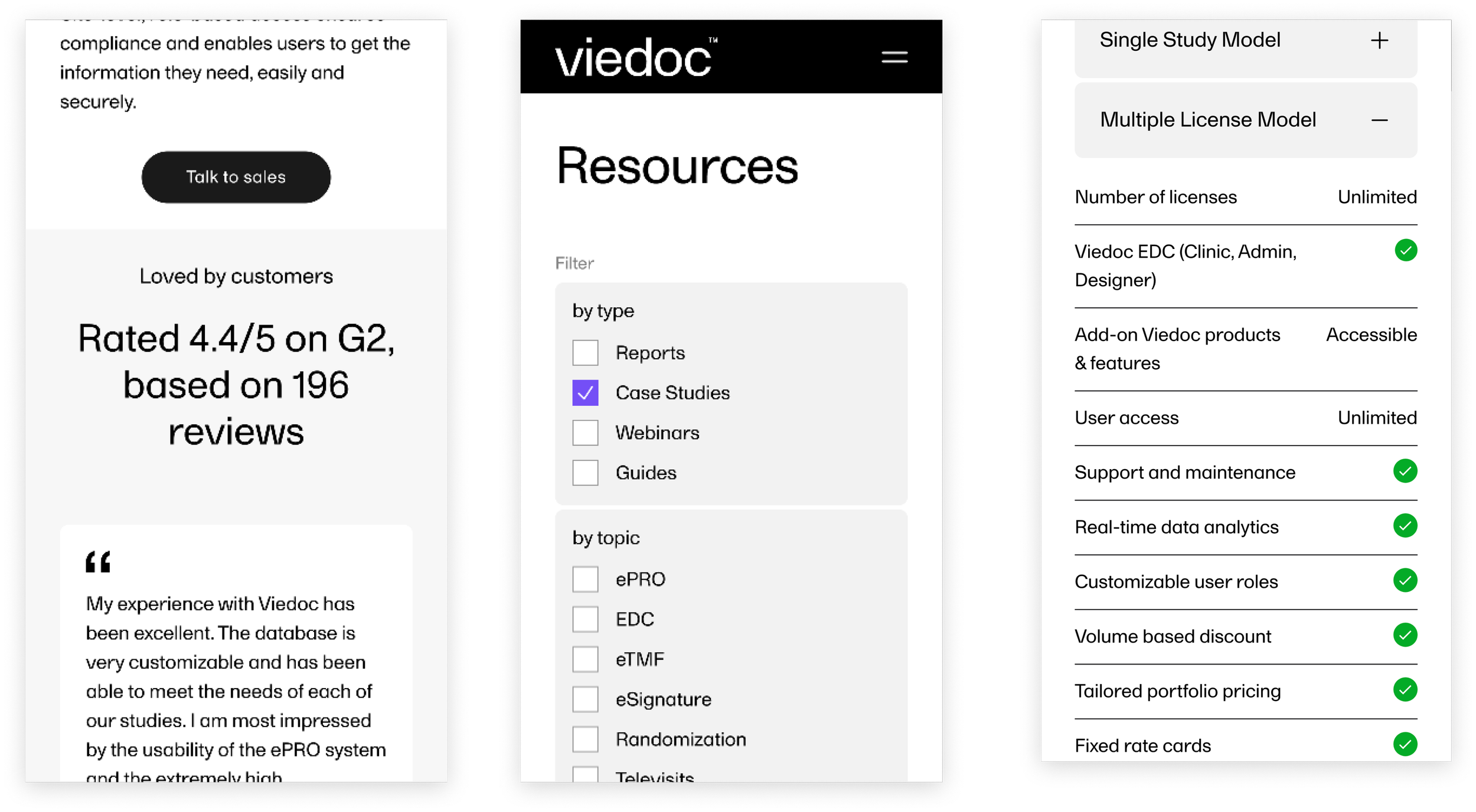
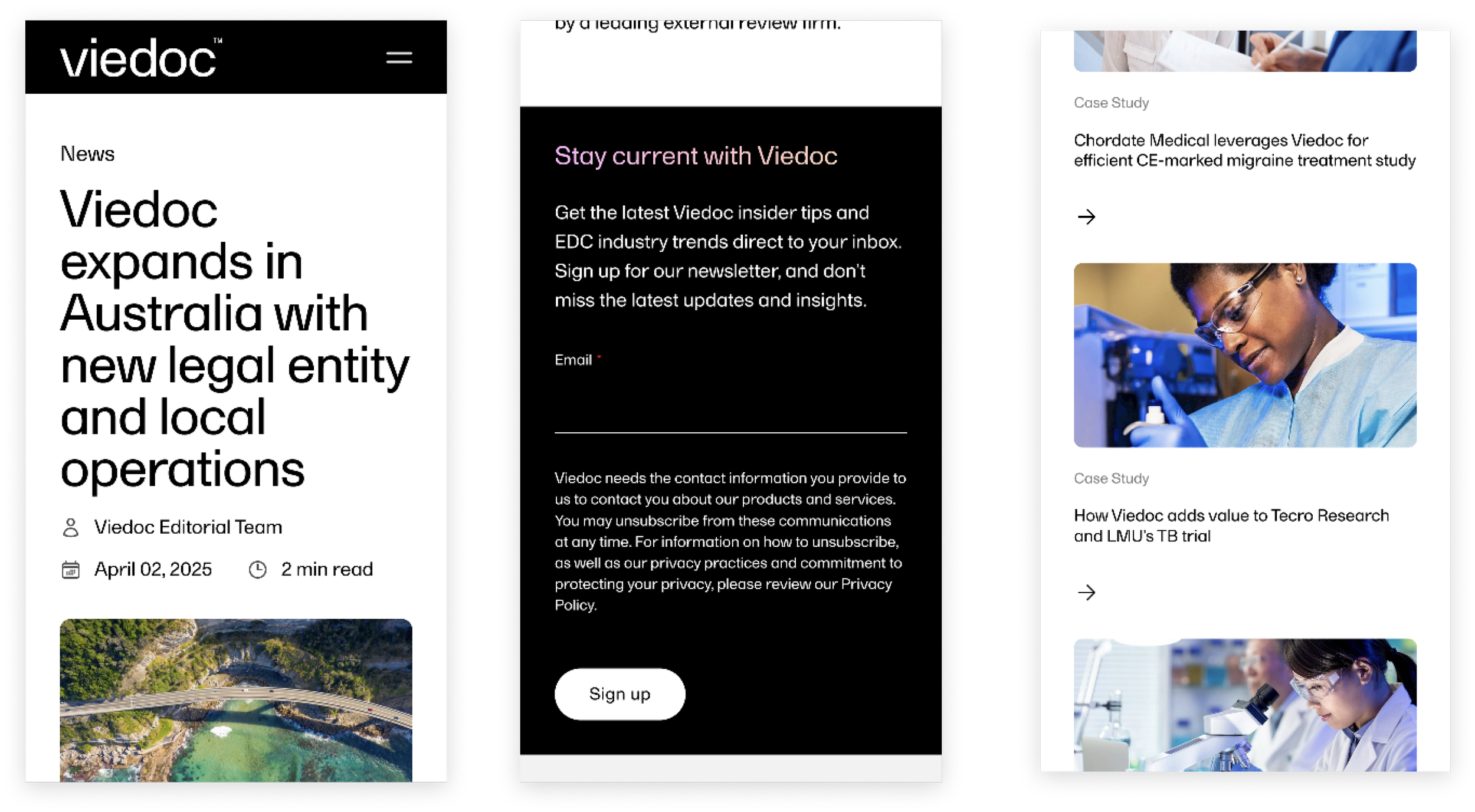
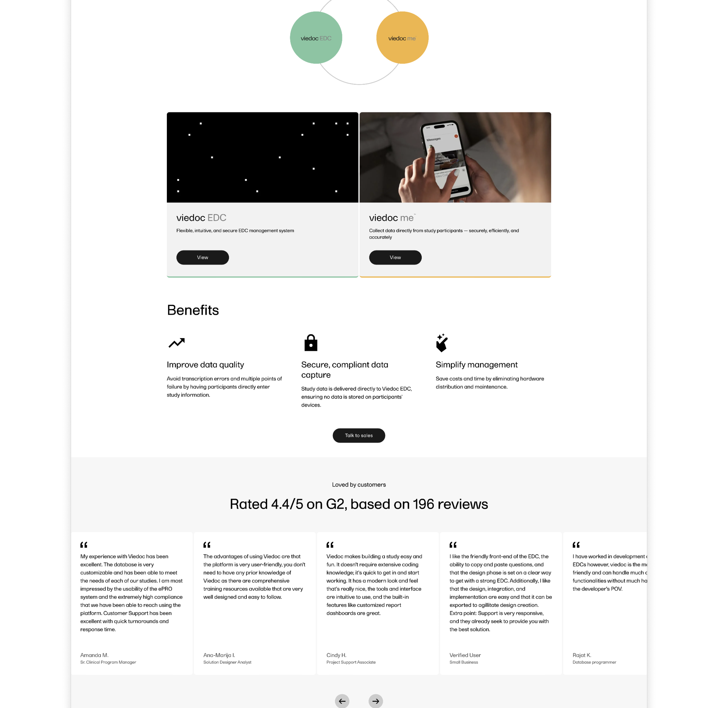
Taking the findings from the wireframing stage and building on Viedoc’s already established brand identity, I created a design that not only communicates Viedoc’s value proposition effectively but provides a much improved overall user experience.
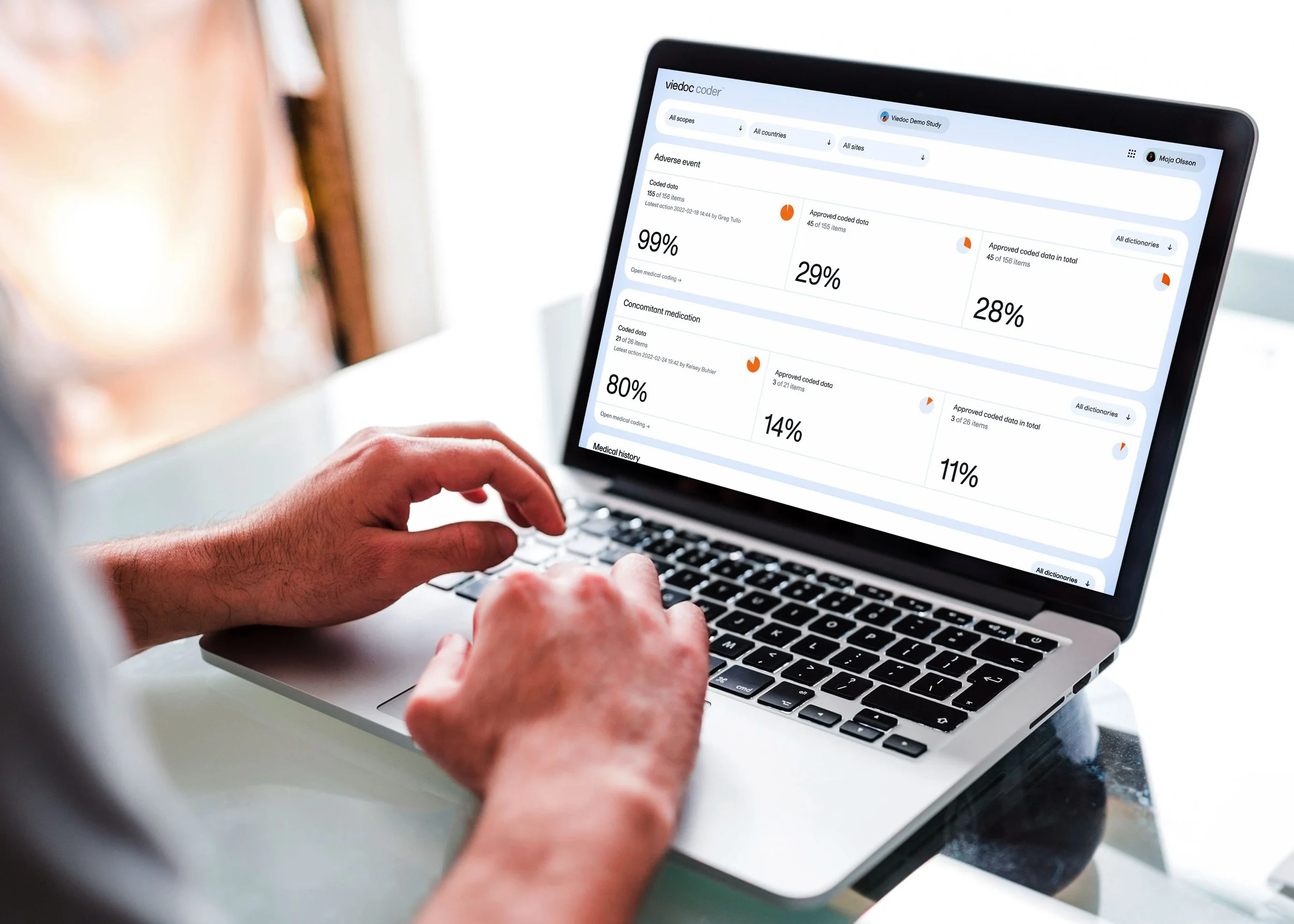
By combining clean, modern, minimalist layouts that utilise whitespace to frame the content and Viedoc’s high-quality buyer-relevant software imagery I was able to create an engaging design where information is presented clearly and logically, maximising the ease for site users to access what they're looking for.
Design
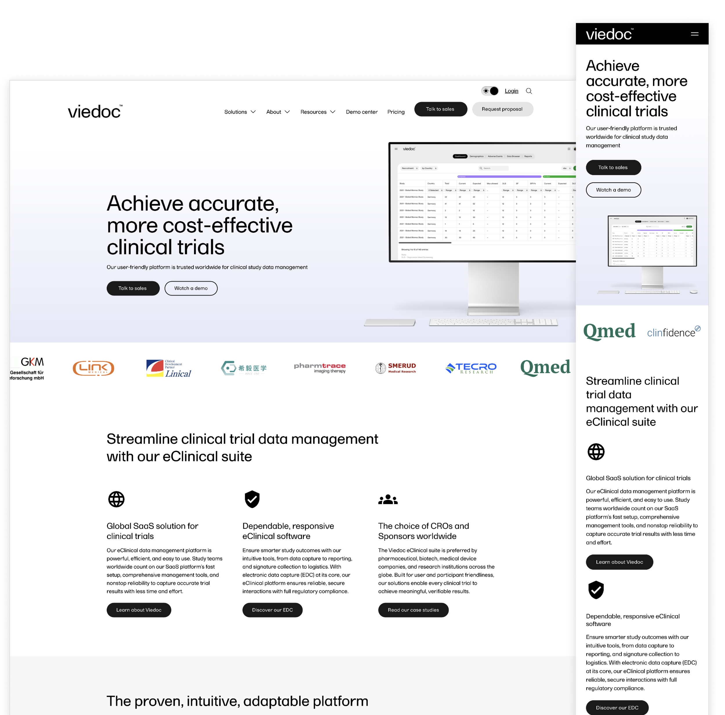
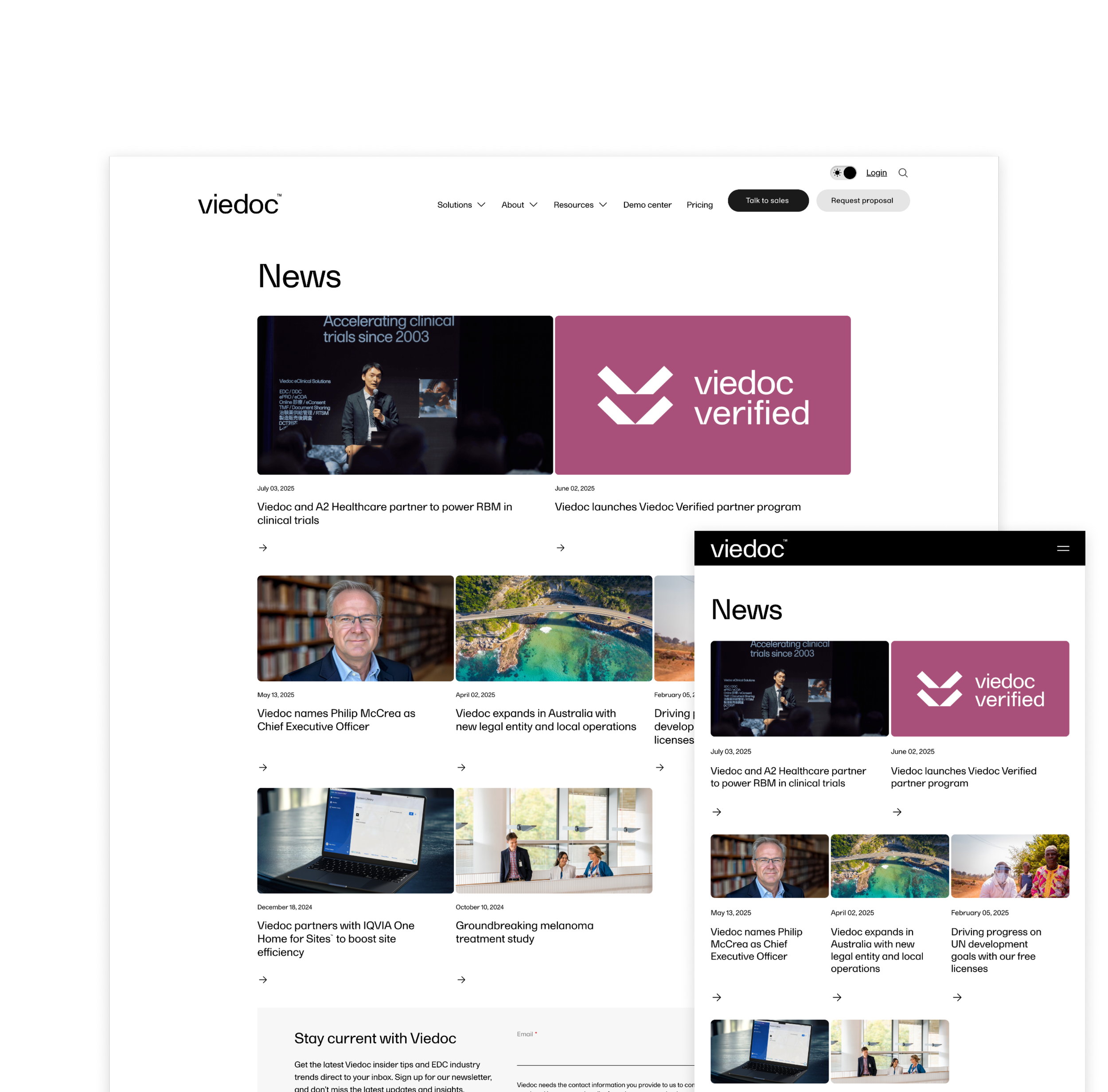

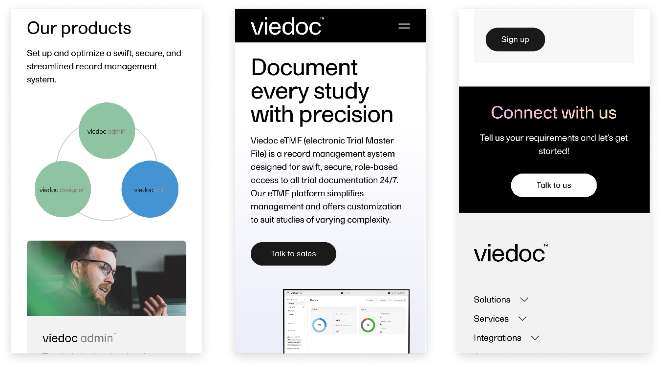
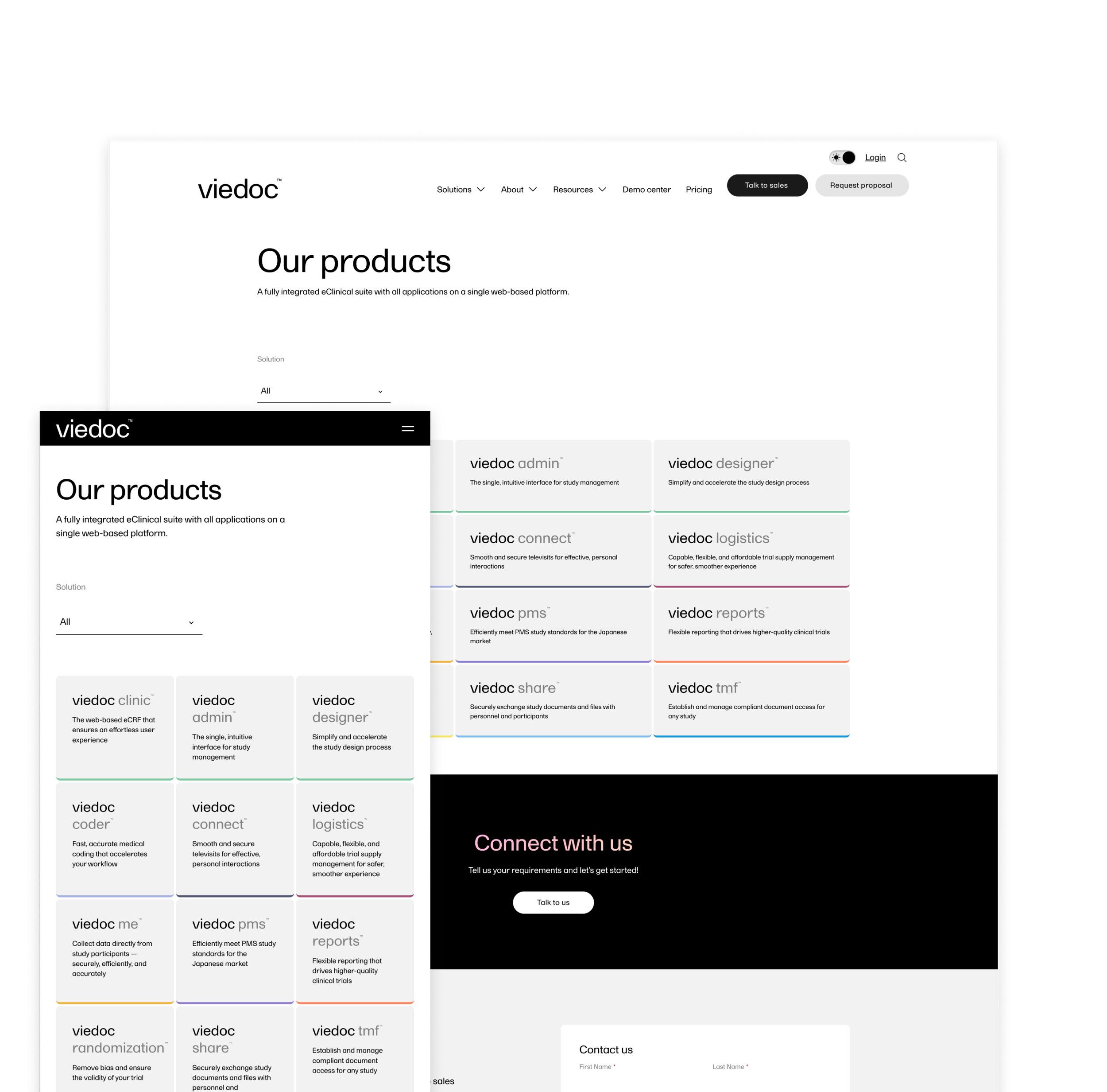
Introducing a comprehensive mega menu to provide Viedoc’s users with the ability to find relevant content quickly and intuitively addresses a key issue of the previous site.

From the start, I designed the site with both light and dark modes, keeping Viedoc and its users in mind. For Viedoc, it’s a way to show they’re modern, user-focused, and in step with today’s design standards — plus it helps keep people engaged and ensures the site feels consistent across devices that switch modes automatically. For users, it’s all about choice: they get control over their experience, with options that suit their comfort, style, and accessibility needs.


Outcome
100% increase in conversion rate
Conversion rate up from 0.7% in Q1 2024 to 1.4% in Q1 2025.
14% increase in demo requests
Comparing figures from Q1 2024 to Q1 2025.
You might also be interested in these projects

Brand + Website
Dan Seymour Golf

Website